
Following a day-long workshop with Rachel Andrews at UX Immersion conference, I came away empowered and inspired to try using CSS Grid. I wanted to try a new project built entirely with grid. I choose to redo our family Christmas card insert. Each year my wife Selena lays out an elaborate Christmas card insert to provide update on the family. This is part of the 2017 insert:
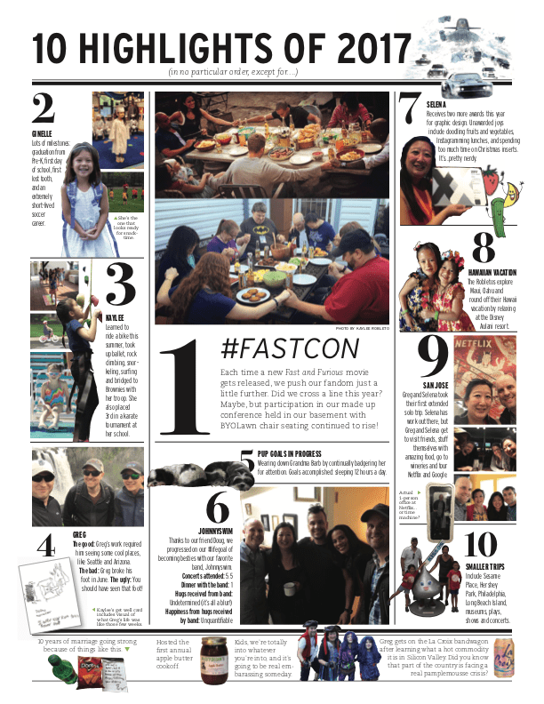
The front page of the Robleto family Christmas Card insert
So over two evenings, I applied what I learned from the course and tackled creating this image as a responsive web page that is currently posted at robletofamily.com. Here’s how I went about it…
Step 1: Outer Columns using grid-template-columns
The first step was to set up a grid structure in three columns. The outer two were set to the same size and the middle column at about twice that size. To translate to Bootstrap, which I have been using to build grids for the past few years, that’s col-md-3 | col-md-6 | col-md-3 `.
I love LOVE that I don’t have to add these classes in the world of CSS Grid. Bootstrap made a lot of design very convenient but it always nagged at me the cost of having to pepper the structural HTML content with so many classes solely for styling. Grid eliminates the need for this. CSS Grid only needs these lines of CSS to set up the whole three column display:
display: grid;
grid-template-columns: 1fr 2fr 1fr;
grid-gap: 20px;
The first line sets up that we are working with CSSGrid. The second line sets the three columns and their relative size to each other. This can be set as pixels or ems or rems, but there is a new player on the scene specifically for Grid. The fr parameter does not equate to any other scale, it’s only serves to set contextual proportions on a grid.
And Beyond
As I continued refining my site, I found uses for defining what is essentially the negative space between these columns so that I could specifically target it laster. That can be done by creating variables in setting them brackets between the column dimensions in the `grid-template-columns`. So the final output of that second line became
grid-template-columns: [full-start] 1.25fr [left-center] 2.25fr [right-center] 1.25fr [full-end];
Setting up the Grid’s outer container
Step 2: Placing the Grid Items
Prior to CSSGrid I would have assessed that this layout couldn’t be done while keeping the code in numeric order.
A key feature of CSSGrid is that any element within the wrapping `display:grid` section can be positioned at any point on the grid. This opened that previously closed door. Using the tremendously helpful Web Developer layout tools in Firefox Nightly, I was able to visualize the grid structure and set header and the 10 boxes one by one.
Header first
The header was first so it defaulted to the correct row. I needed it to span the full length of the row. Initially I did this by setting the `grid-column` to span from `1` to `-1` which works as the positive numbers start counting from the left and the negative numbers start counting from the right, so it results in spanning the full grid. However, I realized I would prefer to have something more intuitive so I used the variables I set earlier in the `grid-template`columns` so instead it reads:
.header {
grid-column: full-start / full-end;
}
Box One
Then I moved on to section `one`. This was going in the center column just below the header. Through some trial and error I came to realize how many row it needed to span to achieve the desired effect, turned out to be four. So section `one` reads:
.one {
grid-column: 2;
grid-row: 2 / 6;
}
Box Two
The next section, `two` is back in the left-most column and smaller than `one` but still a larger height then box `seven` in the third column so it resulted in spanning 2 rows. The resulting code for `two` reads:
.two {
grid-column: 1;
grid-row: 2 / 4;
}
And so it continued one section after another filling in the different spaces on the grid until all 10 were accounted for and the resulting shell of the page resembled the initial card layout.
The layout of the header and all 10 boxes on the Grid
Step 3: Building the Inner Grids
With the outer grid complete it was time to start laying out each section individually. I used another CSSGrid layout approach for the grids within each section. For these I leveraged the `grid-template-areas` capacity that sets the placement of each of the defined items as they are set in the CSS. My impression is that `grid-template-areas` could get unwieldy if trying to be used for the whole larger page, but would work quite nicely for a small descrete component of things that need to be laid out. For box `two` (and most of the other boxes) they broke down to a just a few elements: the number, a title, copy, and 1–3 images. So each was defined accordingly
h2 { grid-area: number; }
h3 { grid-area: title; }
p { grid-area: content; }
figcaption { grid-area: figcaption; }
For the images, there would be some ambiguity just using the `img` tag, but I wanted to avoid having to set classes in the HTML just to be hooks for defining these as grid elements. I found a solution in having the CSS target a unique element of each image, the filename. So the defining continued:
img[src*=”graduating”] { grid-area: image1; }
img[src*=”soccer”] { grid-area: image2; }
Now that all the elements were accounted for it was time to place them appropriately. To match the Christmas card for box `two`, there would need to be a column of the number, title and copy and a second column that included the two images and the caption. Here’s the resulting code:
.box.two {
display: grid;
grid-template-areas:
“number image1”
“title image1”
“content image1”
“content image2”
“content figcaption”;
}
The larger elements image1 is listed three times in a row to essentially merge those rows of the grid together to allow room for it to extend the length of the single cell of number and the cell of title and end somewhere in the multiple cells of content, which also extends across three rows to go from the first image through the second image and end where the caption ends.
And Beyond
I mentioned earlier that all the elements were accounted for, but that should read all the elements on that base z-index level of the grid. Some of the boxes, including box two, also had an image overlaying the other elements that I placed with a `z-index` and then absolute positioning.
Box two of the Grid built with Grid Template Areas
Where I Messed Up
Here are a few things that I could have done better:
Setting sizes too rigidly
Because this treatment is based off a print piece there is an exactness to the positioning of elements. I tried to mirror that but the web is a different beast and some of the heights of the 10 boxes came out at different proportions. This means that everything cleanly ending at the same place without leaving gobs of whitespace became a real challenge. For much of the development time there were large pockets of white space on the left-most column caused by trying to stay balanced with the other columns that were longer than expected. Eventually I made some choices and deviations from the original to try to decrease the extra space.
Forgetting to plan for responsive
Also tied to the precision of replicating a print piece, I had a fair amount of absolutely positioned elements sitting a z-index layer above the Grid. These looked great on a full-width browser but fell apart once I started checking how the site would work on mobile or table browsers. I ended up refactoring in a mobile-first mentality.
Forgetting to start from a baseline and progressively enhance
I was so excited to get started using Grid that I just jumped right in as soon as a I had a quick semblance of HTML structured. This lack of a baseline version of the site struck again when I realized that the outer grid was not necessary for mobile but there wasn’t anything usable to fall back to.
In both these cases I had to go back and refactor starting from a more flexible but less impactful version of the layout that would suit browsers that do not support Grid.
What I Learned
To close, just a few takeaways:
- Understanding just a few basic elements of Grid and practicing those can go a long way. This whole page was built using really only those few concepts mentioned above.
- Grid opens so many doors that were previously closed as far as imagining creative layouts for the web.
- Going to CSSGrid allows for a tremendous Spring Cleaning of the HTML code. So many wrapping `div` containers and Bootstrap required class attributes for formatting can be removed.
- Codepen is a great way to share pieces of a project. I’m probably the last designer/developer to realize this, but count me a convert. Codepen was extremely useful in putting this page and this write-up together.
Those are my thoughts from building out this page. I want to thank Jared Spool and UIE for hosting the UX Immersion conference that lit the spark of my interest in this topic. I want to heartily thank Rachel Andrew for the extensive detail and breakdown of all things Grid to make it digestible, understandable and inspire me to get started. And I want to thank you for reading all the way to the end. :)