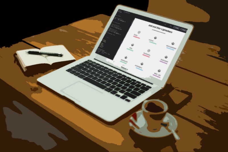
Most examples of CSS grid layouts are blocks or cards stacked in different variations. I looked for a solid example of thin internal grid lines separating a sequence of elements and couldn’t find what I wanted to see, so I built it. For fun, I populated this sample set with different Jedi and their lightsaber colors. The CodePen can be found here: CSS Grid Lines with Jedi Lightsabers
CSS Grid with Border Lines
The first key piece is setting up a grid container when the view-state is larger than mobile. This is done using the following code on a service-grid wrapper:
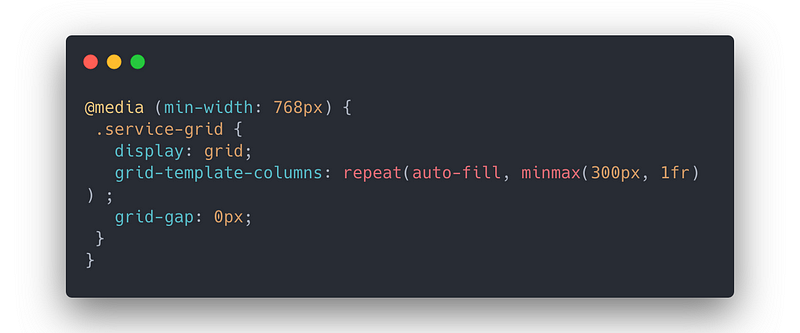
The min size of 300px is arbitrary but works with the outer container with a max-width of 1170px. The grid gap is set to 0px because we want clean lines for the interior dividers balanced between grid cells, so there should be no extra gap space.
Also, each item in the CSS Grid has the following code:
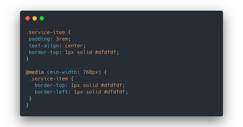
That provides a default border on the top in all cases and adds a border on the left starting post-mobile for tablet and desktop rendering.
Omitting the Outer Borders for Tablet
The above result has an imbalance of the left-most grid items having a left border but the right-most items not having a right border. Similarly, the top row has a top border, but there is no bottom border. We want only internal borders, no external so that the left-border on the left and top borders on the top have to go.
To do this, we need to manipulate the grid using the:nth-child pseudo-class. Starting with these classes for the two-column post-mobile / tablet view
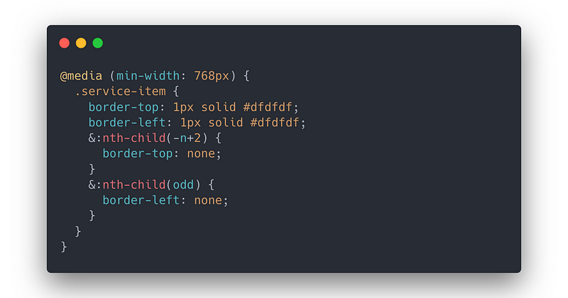
These nth-child lines of code remove the top-border across the first two cells. At this width, the maximum number of rows is two, so the external top border is now removed. To remove the external left border, we can use the nth-child(odd) capability to pull the border off the first, third, and fifth columns, which all happen to be the left-side columns. This completes the look we’re going for in tablet view.
Omitting the Outer Borders for Desktop
For the three-column desktop view, we need to correct the tablet styles we just added and then add the necessary nth-child parameters for three column format. The resulting code is:
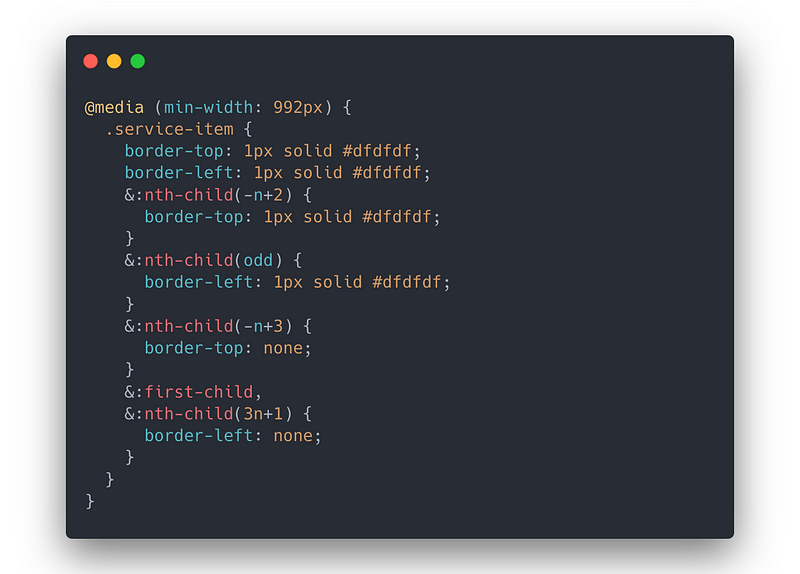
We start by resetting the border-top and border-left everywhere. Then we specifically return the borders removed in the tablet view above. This may be excessive, but I wanted this re-set so we weren’t inheriting any border removal from the previous media query. At this point, we can begin focusing on what’s needed to remove the external borders on the 3-column desktop view.
First, we remove the top borders for the first three cells using the nth-child(-n+3) equation. Then we removed every third cell left border (starting with the 4th) using the nth-child(3n+1). Finally, we circle back and pull the left border off that first cell by calling first-child. This completes the look we’re going for in desktop view.
Setting the lightsabers with SCSS
This exercise was primarily to determine the needed code for the internal-bordered grid. Still, while setting up a series of items to pattern, I went into the SCSS partial and set up the following variables, mixin, and code.
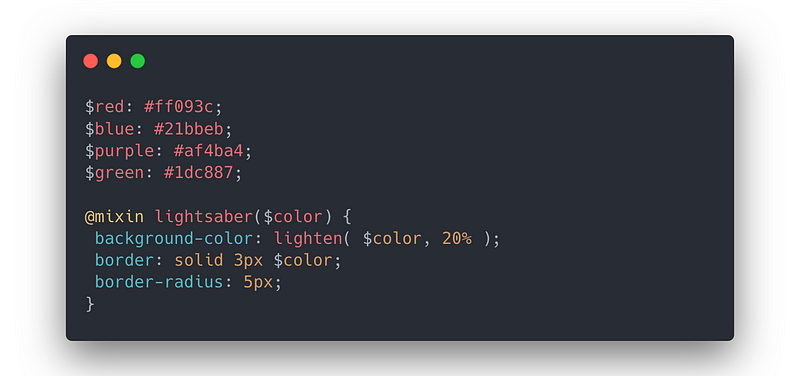
This sets the four color variables for lightsabers. The mixin sets that color variable as the outer-border for the lightsaber element and adjusts the actual element background color to 20% lighter.
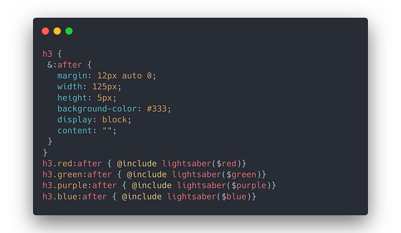
Finally, the lightsabers are not their own elements in the HTML code. These are created completely with CSS using a pseudo :after effect on the name in the h3 tag, as seen here:
That’s about it
The net result, beyond having now a handy reference for remembering lightsaber colors, is this provides a working prototype for seeing how to set in internal-borders using only HTML and CSS Grid.
Again, if you want to view the full pen on CodePen, you can find it here: CSS Grid Lines with Jedi Lightsabers
Disclosures: All thoughts and explanations — the accurate ones and especially the inaccurate ones — are all my own and do not reflect my employer, who does not pay me to make tiny lightsabers. Has this been helpful, reach out and let me know, and tell me who you think has the best lightsaber in Star Wars.
