 Centralized Design System for The Motley Fool
A case study in establishing consistent UI standards and securing stakeholder alignment for scalable design
Overview
The Motley Fool, a financial services company, delivers investment advice and products through digital platforms. This project focused on building a centralized design system using Storybook, enhancing collaboration between Figma-based designers and Vue/React developers. The goal was to ensure consistency, efficiency, and scalability across all digital touchpoints, creating a lasting design structure adaptable to future needs.
Problem Statement
The Motley Fool's design approach lacked consistency, with each new product introducing unique style treatments. This led to customer confusion and slow development cycles. Senior leadership expressed dissatisfaction with the design's look and feel, though their direction was initially vague. Years of quick fixes and resource constraints had resulted in a Bootstrap-based system with fragmented patterns.
This project presented an opportunity to consolidate these disparate styles into a cohesive design system. The aim was to ensure brand alignment, streamline design-to-development handoffs, and provide a flexible system that could evolve alongside Motley Fool's digital products.
Users & Audience
The primary users of the design system were internal: the design team, product managers, and front-end developers who needed a unified framework for efficient workflows. Key stakeholders—including executives, project managers, and the C-suite—depended on the system for consistent, scalable deployment. Ultimately, Motley Fool's customers benefited from a polished, unified experience across digital platforms.
Roles & Responsibilities
As Design Director, I championed and led the establishment of a design system that aligned with business goals and adapted to changing needs. My responsibilities included:
- Defining the system architecture in Storybook
- Ensuring brand fidelity across components
- Establishing integration protocols between Figma and Storybook
- Leading cross-functional collaboration to implement and refine components
- Partnering with product managers to prioritize library expansions and scalability
This strategic approach enabled the design system to support long-term growth beyond my tenure.
Scope & Constraints
The project's scope included translating Pentagram's brand vision into a scalable design system compatible with Vue and React environments. Constraints included:
- A tight timeline to support product releases
- Balancing priorities across high-demand projects
- Ensuring the design system could be flexible enough to adapt over time
Process & What You Did
Track One: Finding the New Design
- Brainstorming & Stakeholder FeedbackI established committees within Product, Tech, Editorial, and other departments to analyze the existing system and explore new design directions. Through iterative sessions, we balanced divergent and convergent feedback to create a path forward.
- Competitive Research & Customer InterviewsI directed the UX Research team to analyze competitor design patterns favored by senior leaders while gathering user feedback to align the redesign with both business and member needs.
- Mood Boards & High-Fidelity DesignsI initiated low-fidelity mood boards to explore motifs, refining them based on committee feedback. Moving to high-fidelity mockups, I showcased complete page samples for stakeholder review, iterating based on feedback.
- Stakeholder Demos & Iterative FeedbackI presented refined mockups to senior leaders, leading rapid design demos that incorporated new components and feedback in each session. This iterative feedback process shaped the final approved design.
Track Two: Establishing the Design System
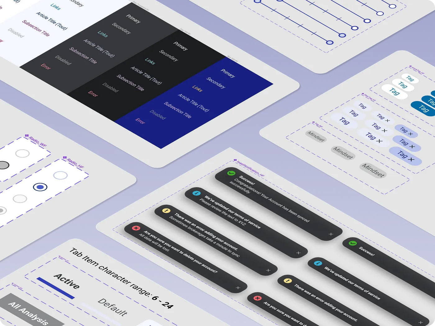
- Process Design & Flow DiagramsI collaborated with design and development leaders to define a process for documenting all elements in Figma and syncing them with coded components in Storybook, establishing a single source of truth.
- Design Tokens & StandardizationI led the creation of core design tokens—such as colors, fonts, and spacing—that became the foundation of the Figma library and Storybook's configuration, supporting a standardized approach across platforms.
- Testing & Library DevelopmentI worked with lead designers and developers to create a prototype for extracting design elements into Figma and Vue.js components in Storybook. We incorporated new features from each demo into the growing design system library.
Bringing the Tracks Together: Site Redesign with a Matching Design System
- Development Handoff & QAAs the redesign reached approval, I coordinated with Design and Development leads to translate Figma components into Storybook. We divided the work into achievable sprints, ensuring team alignment and sprint deliverables.
- Launch & Ongoing AdaptationI led visual QA to verify design consistency. After the launch, I monitored feedback channels, overseeing adjustments to ensure the system's responsiveness to user needs. This adaptive approach enabled the design system to evolve based on real-time insights.
Results & Outcomes
The centralized design system successfully unified Motley Fool's digital products, creating a consistent, flexible foundation that continues to support new product iterations. With an atomic design library mirrored in Figma and Storybook, the system accelerated development by reducing redundant work. Component reuse led to a 40% reduction in development time for new features, freeing resources for high-impact tasks.
Reflecting on this project, I recognized the importance of establishing strong cross-functional alignment early on, which ensured compatibility across frameworks and allowed the system to adapt over time. This ongoing, evolving design system remains a core asset, facilitating efficient adjustments to UI components across digital products even beyond my involvement.
Impact
This redesign and design system laid the groundwork for a lasting, scalable approach to digital design at Motley Fool. While I transitioned from leading the project after two years, the system was well-established and has since continued to adapt to changing needs. The component-based system reduced time-to-market and resource costs by 92%, allowing teams to quickly incorporate new components into a cohesive whole. The design system's adaptability has proven invaluable, providing a resilient foundation that supports Motley Fool's evolving product suite.