 The Motley Fool’s Comprehensive Global Rebrand
A case study on harmonizing diverse business lines under a cohesive, trusted brand identity for a global audience.
Overview
The Motley Fool is a leading financial services company with a mission to empower individuals through investing education and financial guidance. Offering stock analysis, financial planning, and advisory products to a global audience, the company’s primary goal for this rebranding project was to unify eight business lines and 70 products under a cohesive brand identity. This shift aimed to build trust, enhance brand recognition, and streamline customer experiences across international markets.
The Challenge
After 30 years without a major rebranding, The Motley Fool’s brand identity had become inconsistent across its diverse products and global markets. Each business line operated semi-autonomously, leading to fragmented customer experiences and diminishing brand recognition. This rebranding effort was critical to create a standardized visual and messaging framework that unified the brand, improved customer trust, and reduced time and resources for new product launches.
Users & Audience
The primary audience included The Motley Fool’s wide customer base, from individual investors to institutional clients across six countries. Internally, key stakeholders were executives, marketing teams, product managers, and regional leads, all of whom needed a clear and unified brand identity to effectively communicate the company’s mission. Each user group required a brand experience that was visually consistent, recognizable, and adaptable to the unique regulatory and cultural requirements of each market.
Role & Responsibilities
I served as the Brand & Identity Design Lead, responsible for strategy and execution. Working closely with Pentagram, a renowned design agency, I collaborated with in-house designers, product managers, and marketers. The project required close partnerships with C-level executives and regional business leads to ensure alignment with corporate goals. Conducted in a hybrid format, the rebranding relied on agile cross-functional collaboration across time zones, leveraging remote communication tools to keep all teams aligned.
Scope & Constraints
This enterprise-wide rebranding initiative had a tight two-year timeline to align the brand across six countries and eight business lines. The initial scope expanded as new products emerged, demanding rapid adaptability while maintaining consistency. Budget constraints also required efficient resource allocation, and the brand had to comply with global regulatory standards without compromising on creativity or clarity.
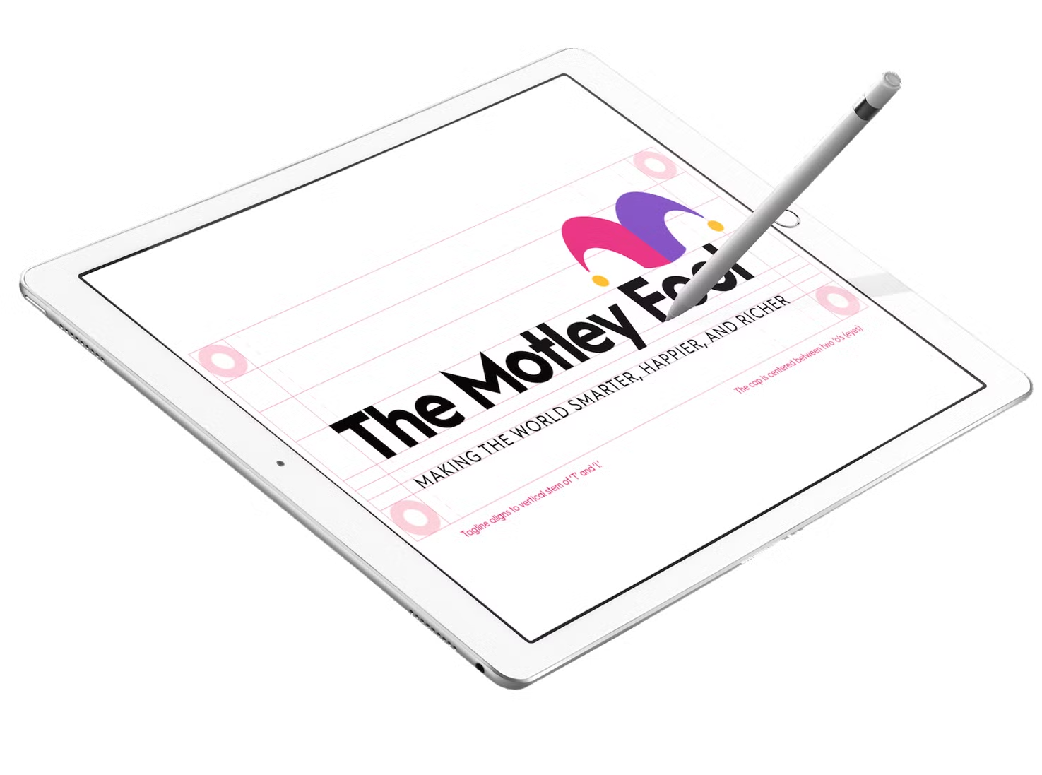
The Process 1. Discovery Phase: Conducted in-depth stakeholder interviews and brand audits across each business line to identify gaps and opportunities for a cohesive identity. 2. Strategic Alignment: Partnered with Pentagram to define core brand elements, including voice, visual style, and tone, and worked with C-level executives to align these with the company’s long-term goals. 3. Design System Development: Created a comprehensive Design System that included typography, color schemes, iconography, and UI components. This system was essential for scalability and consistency across all digital and physical brand assets. 4. Implementation & Testing: Coordinated phased rollouts across different markets and product lines, with pilot programs to assess customer response and refine brand elements as needed. 5. Training & Documentation: Led workshops, developed guides, and provided training resources for internal teams, ensuring consistent brand application and supporting ongoing maintenance and scalability.
- 1. Discovery Phase: Conducted in-depth stakeholder interviews and brand audits across each business line to identify gaps and opportunities for a cohesive identity.
- 2. Strategic Alignment: Partnered with Pentagram to define core brand elements, including voice, visual style, and tone, and worked with C-level executives to align these with the company’s long-term goals.
- 3. Design System Development: Created a comprehensive Design System that included typography, color schemes, iconography, and UI components. This system was essential for scalability and consistency across all digital and physical brand assets.
- 4. Implementation & Testing: Coordinated phased rollouts across different markets and product lines, with pilot programs to assess customer response and refine brand elements as needed.
- 5. Training & Documentation: Led workshops, developed guides, and provided training resources for internal teams, ensuring consistent brand application and supporting ongoing maintenance and scalability.
Outcomes & Lessons Learned
The rebranding resulted in a 92% improvement in brand consistency, elevating The Motley Fool’s identity in key financial markets and making it instantly recognizable across platforms. With a centralized Design System, the time-to-market for new products accelerated by 300%, supporting faster product development and boosting customer loyalty.
Reflecting on this project, I learned the importance of agility in large-scale branding efforts and the value of early stakeholder engagement for smoother approvals and momentum. In hindsight, starting regional-specific testing sooner could have sped up the refinement process, helping balance global consistency with localized relevance.
Thank you for reviewing this case study. For insights on other transformative projects, explore the following:
- Simplifying The Motley Fool’s Product SuiteA case study on creating a unified, tiered membership structure to enhance customer experience and drive growth
- Global Rebranding: Unifying Motley Fool’s brand under a comprehensive design system
- Levels Structure: Simplifying and enhancing customer experience through a tiered product suite
- Design Team Development: Building and leading a high-impact design team at The Motley Fool
- Digital Design System in Storybook: Bridging Figma and Storybook for cross-functional alignment
Feel free to reach out for more details or discussion on these projects!
Disclaimer: Confidential details have been omitted or modified in this case study to protect proprietary information. All insights and analysis are my own and reflect my personal experience on this project.