When inspiration strikes and CSS flexes its muscles.
Discovering UIverse
I don't often visit Product Hunt, so finding myself there—and discovering the fascinating UIverse—came as a pleasant surprise. While browsing their collection of components, a rotating word carousel caught my attention. Inspired by @kennyotsu's post, I wondered: could I recreate this using only semantic markup and basic CSS?
The Idea: A Versatile Role Showcase
In versions 3 and 4 of my robleto.com website (now on v5), I attempted to create a component that would showcase multiple roles or titles in a single, elegant space. The idea was to use smooth animations to cycle through text elements, creating an engaging display that would grab attention while maintaining a clean, professional look. Though I was never satisfied with those earlier attempts and abandoned the concept, I've now finally found a solution I love.
The Process: HTML and CSS Magic
HTML Structure
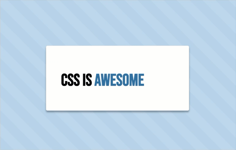
The structure is simple and semantic: a div for the card and a rotating ul list of roles.
<div class="card">
  👋 Hi! I'm Greg. I'm a
  <ul>
    <li>CSS Artist</li>
    <li>UI Engineer</li>
    <li>Design Director</li>
    <li>UX Lead</li>
    <li>Product Designer</li>
    <li>Mentor & Coach</li>
    <li>Brand Strategist</li>
    <li>Creative Leader</li>
    <li>Digital Artist</li>
    <li>Husband & Father</li>
  </ul>
</div>
CSS Styling (SCSS)
Using keyframes, I got a smooth word rotation where each title flows naturally into the next. The card has a clean, modern aesthetic with a responsive layout.
// Global Variables
$bg-color: #fff;
$highlight: #316FA1;
$text-size: 2.2rem;

body {
  background: lighten($highlight, 40%);
  background-image: repeating-linear-gradient(45deg, rgba(#FFF, 0.1), rgba(#FFF, 0.1) 30px, transparent 0, transparent 60px);
  font-size: $text-size;
  font-weight: 600;
  font-family: 'Bebas Neue', sans-serif;
  min-height: 100vh;
  display: flex;
  justify-content: center;
  align-items: center;
}

.card {
  display: flex;
  justify-content: center;
  align-items: center;
  background-color: #fff;
  border: 1px solid #e8e8e8;
  border-radius: 0.3rem;
  padding: 5rem 3rem;
  box-shadow: 0 5px 5px #0005;
}

.card ul {
  overflow: hidden;
  position: relative;
  font-size: $text-size;
  height: $text-size;
}

li {
  display: block;
  height: 100%;
  padding-left: 0.5rem;
  color: $highlight;
  animation: rotate-the-words 10s infinite;
}

@media (max-width: 600px) {
  .card {
    flex-direction: column;
  }
}

@keyframes rotate-the-words {
  0% { transform: translateY(100%); }
  2%, 10% { transform: translateY(0); }
  12%, 20% { transform: translateY(-100%); }
  /* Continue for additional items */
}The Result: A Reusable, Elegant Component
The final product is a clean, visually dynamic card where titles rotate smoothly to capture attention without overwhelming the viewer. It’s perfect for:
- Portfolio sites: Highlight your skills in a compact, polished design.
- Landing pages: Showcase key features, product benefits, or roles.
- Storytelling elements: Use text animations to guide the narrative.
The best part? It’s pure CSS—no JavaScript bloat, just clean, efficient code.
What I Learned
- Revisiting CSS’s capabilities reminded me that simple solutions often deliver the strongest impact.
- Working with
keyframescreatively and combining text animations with flexible layouts sparked ideas for similar components. - Best of all, it’s deeply satisfying to create something both visually appealing and functional.
Try It Yourself
The code is lightweight, customizable, and ready for your own creative spin. Want faster animations? Adjust the duration. Need more roles? Simply add more <li> tags.
Explore it here: Dynamic Word Carousel Card on CodePen. (Feel free to fork, tweak, and make it yours!)
Key Takeaway
This isn’t just a rotating list; it’s a demonstration of how clean design and simple CSS can tell a story. Whether it’s your roles, features, or favorite quotes, the possibilities are endless.
More abstracted takeaway… it’s good to explore, sometimes inspiration comes from the most unexpected places.