Most design hiring exercises are built wrong. They either test the wrong thing, create unnecessary friction, or both. I spent the better part of a year learning this the hard way before landing on an approach that actually worked.
While hiring front-end developers and UI designers, I wanted candidates to complete a short project after the phone screen — something open-ended that would show how they think and give us material to discuss in the team interview. Simple enough in theory.
My first attempt was to find a real page in our product that needed work, point a spotlight at it, and ask candidates what they’d improve. The problem: the page was behind a login wall. I set up temporary accounts for each candidate, and both times the credentials expired mid-test, locking them out of the page they were supposed to be evaluating.
Next round, I solved the access issue with a longer-lived account. But between candidates, I couldn’t leave the unloved page alone. I captured it as a story, the team picked it up, and the experience got redesigned. I’d accidentally fixed my own test case.
A fellow hiring manager suggested his approach: have candidates stand up a Django environment and do some light MVC work. Reasonable for engineers, but for UI designers and front-end developers unfamiliar with the framework, just getting the environment running was a wall. Non-starter.
So I needed something that was standalone, outside any login wall, didn’t require environment setup, and was open-ended enough that I wouldn’t be tempted to “fix” it myself. That’s when I looked at CodePen differently.
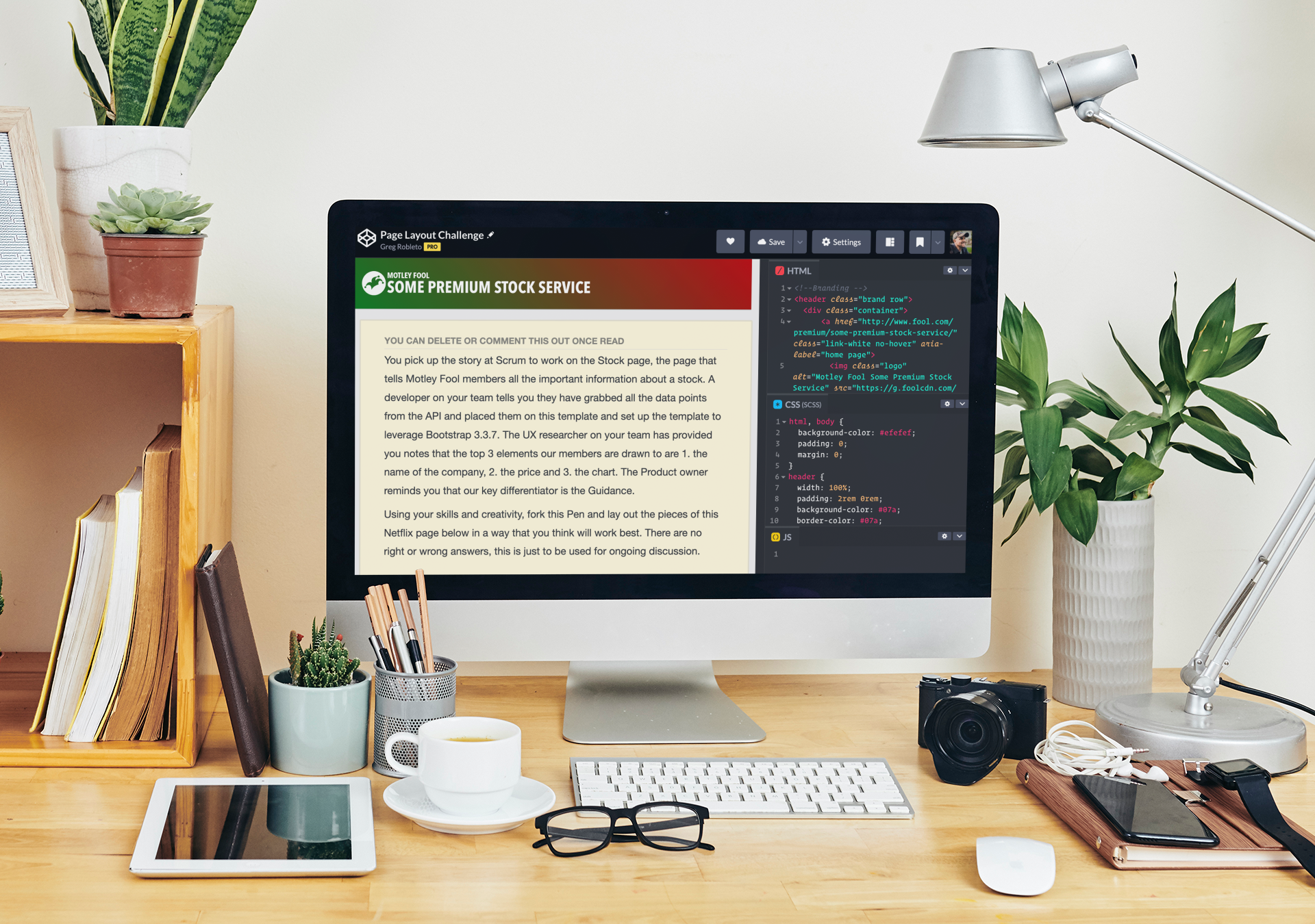
I’d used CodePen casually for years — sandboxing ideas, browsing for inspiration. But it solved every problem I’d been running into. I built a pen called the Page Layout Challenge: a collection of common stock page components (name, price, chart, key stats, analyst insights) with no prescribed layout. The candidate’s job is to arrange them however they see fit.
There are no wrong answers. The exercise isn’t a test to pass — it’s a starting point for a conversation about why the candidate made the choices they did. How did they prioritize information hierarchy? What did they do with limited space? What tradeoffs did they make, and can they articulate them? Those discussions told me more about how someone thinks as a designer than any timed coding challenge ever did.
If you’re hiring for design or front-end roles and struggling with the same friction I was, the approach is worth trying. You can explore the Page Layout Challenge pen here.
Disclosures: All thoughts are my own. CodePen didn’t ask me to write this, and the only compensation I’ve received from them is years of free sandboxing, which honestly is compensation enough.