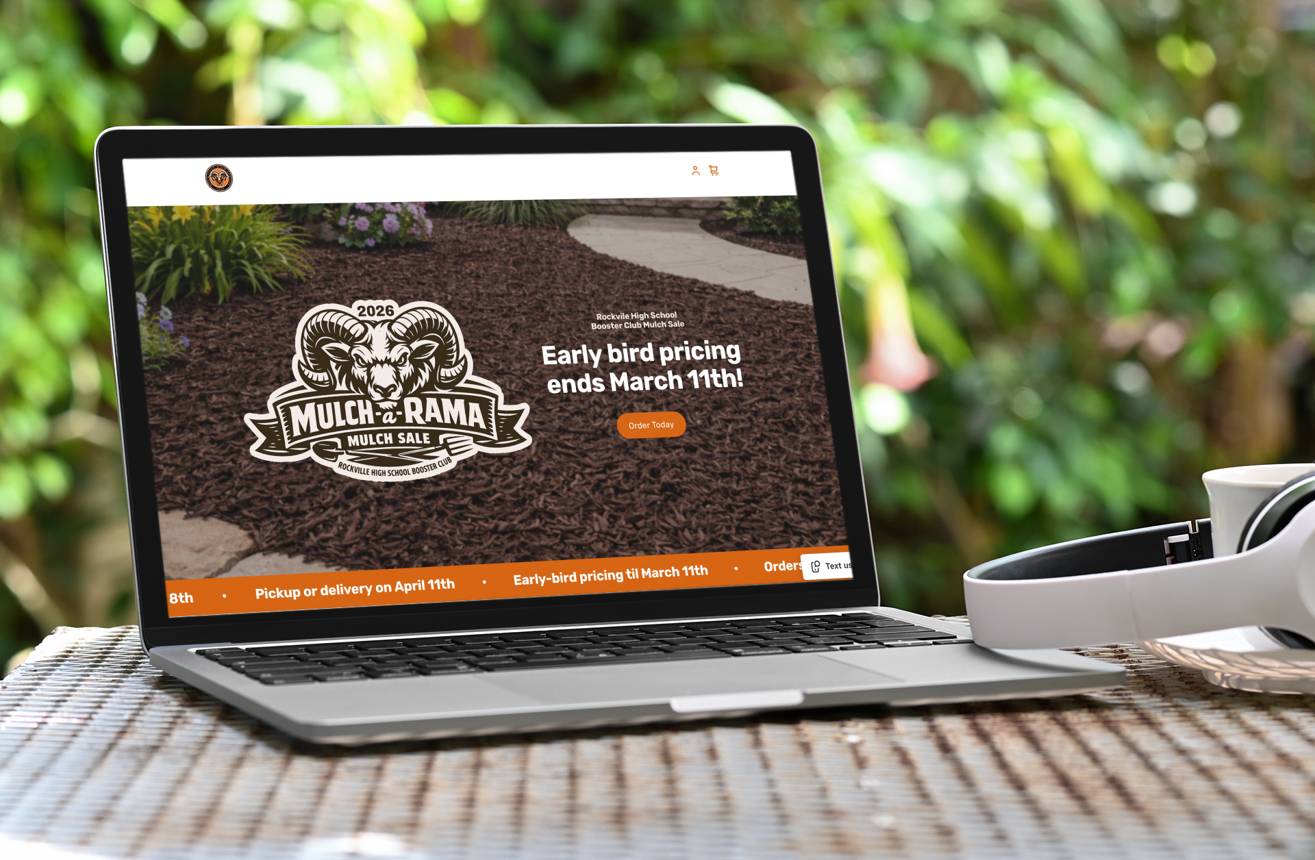
This weekend I rebuilt the Rockville High School Booster Club Mulch Sale website.
They’re set up in Square, which isn’t exactly a playground for custom web experiences. It’s structured, opinionated, and fairly constrained. You don’t invent new interaction models—you make smart decisions inside the box.
Which is fine. Constraints are clarifying—and honestly, a fun challenge.
The original site worked in the sense that orders could be placed and payments could be collected. But in practice it relied on a fair amount of manual follow-up: reminders, clarifications, and small fixes after the fact.
So it functioned, mostly.
I didn’t go in intending to reinvent checkout or overhaul the design. I just knew I had the skills to get it launched in time for the sale. And once I was in it, I found myself focused on reducing the number of places where an already-overtaxed volunteer had to step in and smooth things over.
This is the kind of project that seems small on paper—until you realize how much it asks of the people running it, and how many little moments can either build confidence or create cleanup.
The Invisible Wins
Most of the improvements were behind the scenes—things that reduce follow-ups and manual handling.
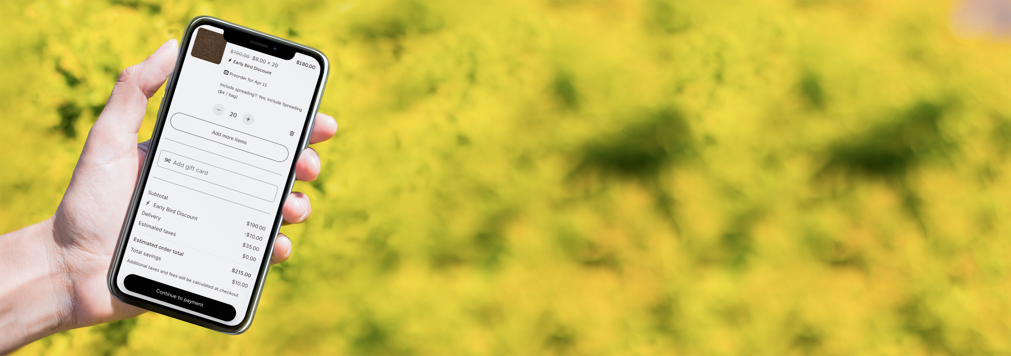
- Discounts apply reliably and only when they’re supposed to.
- Delivery fees are automatic (not a separate “don’t forget this” line item).
- Shipping and add-ons are untangled.
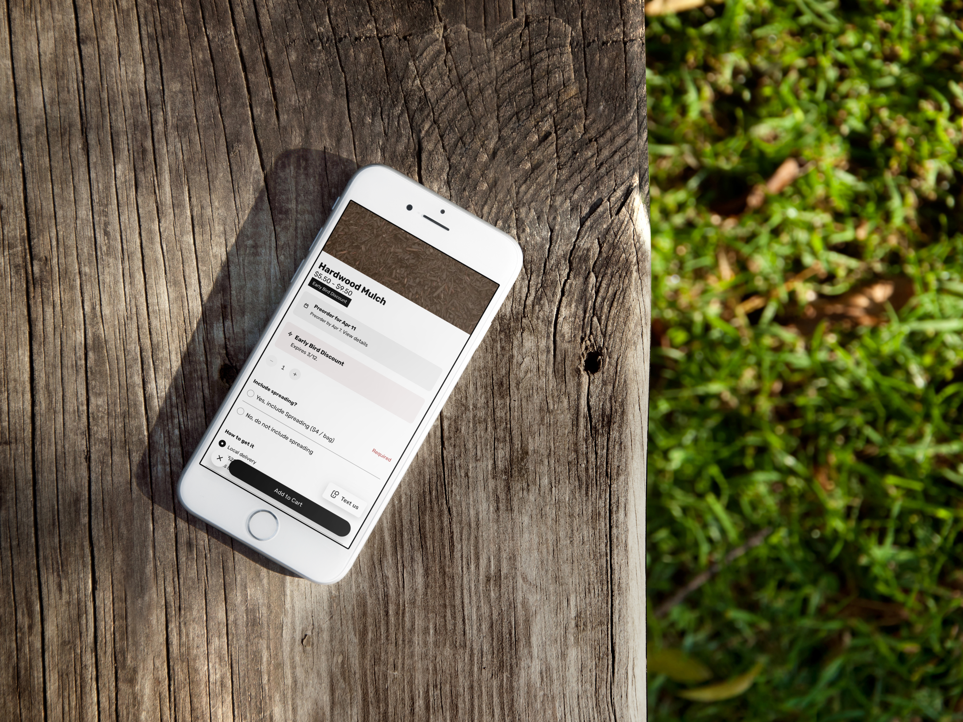
- Mulch spreading is a real add-on for mulch orders, not its own product.
- Minimum spend + delivery radius rules are validated up front before someone pays.
- Checkout asks fewer questions and stays focused.
These changes don’t draw attention to themselves. They show up as fewer edge cases, fewer “quick question” messages, and fewer awkward follow-ups about missing details.
They’re operational wins. They matter enormously.
But they don’t necessarily change how the site feels when you land on it.
The Visible Wins
The second layer was clarity—making the site easier to read, faster to understand, and harder to misinterpret.
Square limits layout flexibility—but it still allows thoughtful choices about emphasis, grouping, and visual hierarchy.
So within those constraints:
- Cleaner typography makes important elements easier to find fast (especially on mobile).
- Color is used on purpose so the primary actions stand out.
- Content is grouped around how people decide — what to buy, delivery/pickup, and add-ons.
- Lists are separated where it matters so details don’t blur together.
- Imagery got an upgrade with better product photos and garden-bed hero visuals.
This wasn’t about making it fancy. It was about making it clearer and easier to move through without needing someone to explain it.
Because when you’re asking someone to spend money—even on mulch—clarity does a lot of heavy lifting.
The Real Lesson
Infrastructure removes friction. Clarity removes hesitation.
The first reduces cleanup. The second builds confidence.
Either one helps. But together they do something better: the process runs smoothly and it feels straightforward to the people using it.
When both are in place, the experience feels simple—not because it was simple to build, but because fewer rough edges remain.
People can tell the difference between:
- “This works.”
- and
- “This makes sense.”
And that difference is worth chasing—even inside a constrained platform, even for something as everyday as a mulch sale.
Why I Spent the Time
This wasn’t a portfolio piece or a client engagement. It was a weekend project.
These Booster Club fundraisers run on volunteers—people coordinating logistics, answering questions, and doing the unglamorous follow-up that keeps everything moving.
My way of helping was to take something that required a fair amount of manual intervention and make it more self-sustaining: fewer traps, fewer exceptions, fewer “did you also add X?” moments.
The site now behaves better under the hood and is clearer on the surface. That combination makes it easier for families to order—and a little easier for the people donating their time to run it.
I’m grateful there are people who show up for this stuff. This was just my way of showing up.
The site now behaves better under the hood and is clearer on the surface. That combination makes it easier for families to order—and a little easier for the people donating their time to run it.
Disclosure: These opinions are my own. My employer does not pay me to improve mulch checkout flows, and the Booster Club did not request a minor philosophical reflection on buying compostable ground cover.