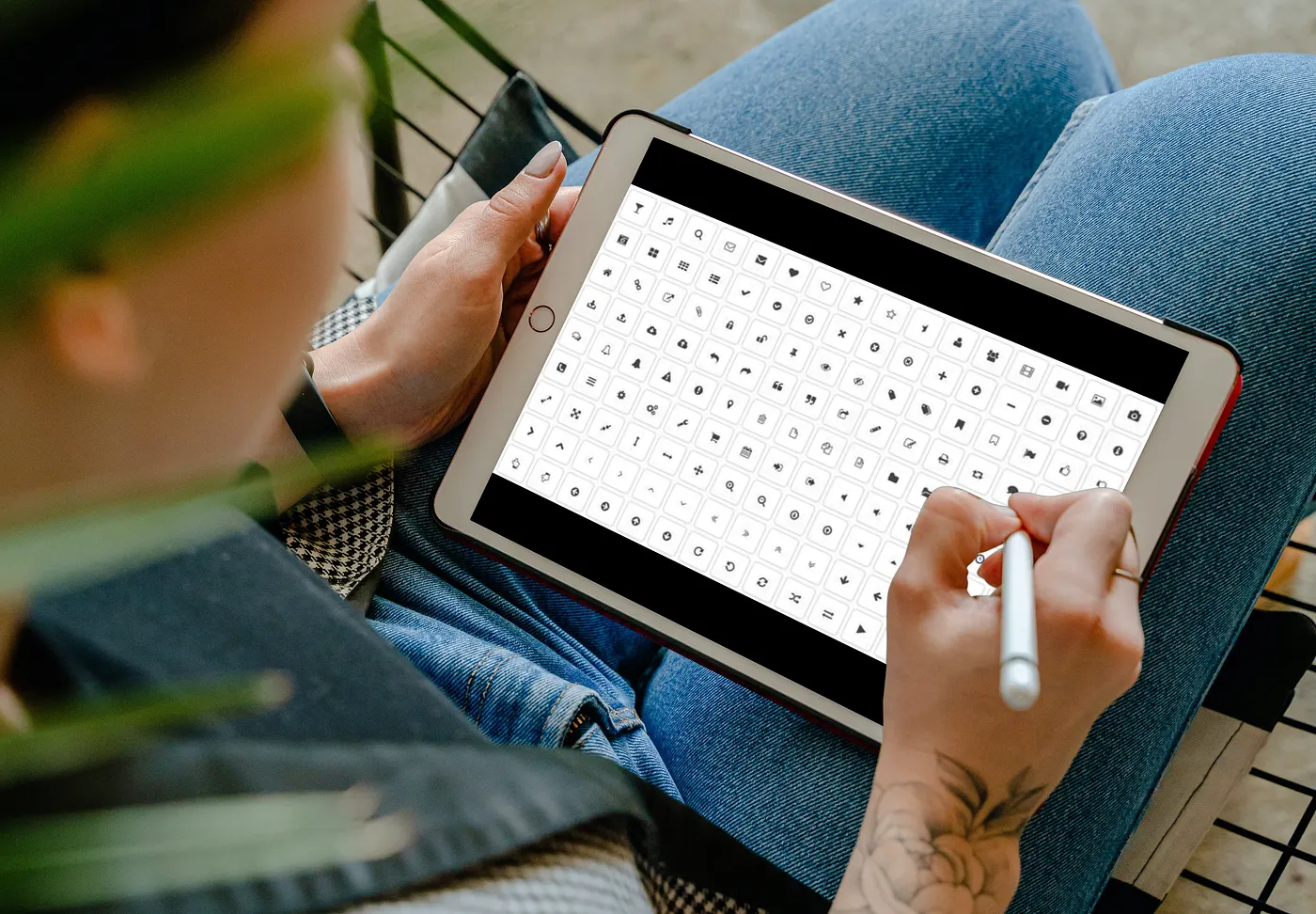
Iconography is one of the quieter workhorses in digital design. It doesn't get the attention that typography or color palettes do, but it shapes how people navigate, understand, and trust the products they use every day. Here are five specific ways iconography serves both users and the businesses behind the screen.

Visual clarity
Icons compress meaning into a small space. A magnifying glass means search. A gear means settings. Users don't need to read a label to understand the action — the symbol does the work instantly. This matters most in space-constrained environments like mobile interfaces or dense dashboards, where every pixel carries weight. Well-chosen iconography reduces cognitive load: users spend less time reading and more time doing.

Brand recognition
Think about how immediately you recognize the Apple logo, Twitter's bird, or Slack's hashtag mark. Iconography gives brands a visual shorthand that works across every touchpoint — app icons, websites, packaging, social media. When a company develops a consistent icon style (uniform stroke weight, shared color palette, cohesive metaphors), it builds a visual language customers recognize at a glance. That recognition compounds into trust, and trust compounds into loyalty.

Usability
Icons serve as wayfinding in digital spaces. A home icon orients you to the starting point. A back arrow tells you escape is one tap away. These aren't decorative — they're functional landmarks that help users build a mental model of where they are and what they can do. This is especially valuable in complex systems with deep navigation. Icons let users leverage patterns they've learned from other products, reducing the learning curve for yours.

Accessibility
Iconography and accessibility have a productive relationship when done right. Icons paired with proper alt text give screen readers meaningful content to announce. High-contrast icon designs help low-vision users distinguish interactive elements from static content. And for users with cognitive disabilities, a well-designed icon can communicate a concept more immediately than a text label. The key distinction from usability: accessibility isn't about making things easier for everyone — it's about making things possible for people who would otherwise be excluded.

Cultural sensitivity
Text carries cultural and linguistic assumptions. Icons can sidestep them. A healthcare organization operating across multiple countries might use universally understood symbols for hygiene and disease prevention rather than relying on translated text that may carry unintended connotations. Iconography can also signal cultural respect — using symbols that are meaningful and familiar to a local population demonstrates awareness that a wall of translated text simply can't. In global products, thoughtful iconography isn't a nice-to-have; it's a form of inclusion.
Disclosures: All thoughts and explanations — the accurate ones and especially the inaccurate ones — are my own and do not reflect the views of my employer. No, really, they don't. Reach out if this was useful, and follow for more on design, coding, and the quiet power of small pictures.