

There's a famous diagram from World War II — a bomber overlaid with red dots showing where returning planes had taken fire. The instinct was to reinforce those areas. But the statistician Abraham Wald saw the opposite: the places without bullet holes were the places that mattered. The planes that took hits there never came back.
It's a well-worn example of survivorship bias, and the finance industry has a version of the same problem. The conventional read is that people leave financial products because of bad returns. That's partially true — people swap financial vehicles all the time, dropping a small-cap ETF for an international fund when performance disappoints. But financial products — the advisor you work with, the app you check every morning — those have an incumbency effect. Once someone is established, it's remarkably hard to get them to move.
All of that is working within the survivorship bias. What's not accounted for are the people who never signed up in the first place.
They didn't leave because of bad returns. They left before they ever started — because they didn't trust that what they were looking at was right for them.
That sounds like a business problem, but it's actually a design problem. When an investor can't quickly understand what a fund does, how it's performing, or why it's structured the way it is — and why any of that would make sense for their portfolio — the response isn't confusion. It's suspicion. And suspicion is quiet. It doesn't show up in the data. There are no bullet holes to count. It just looks like someone closing a tab.
Most financial interfaces are built by people who understand the data deeply but haven't thought about what the person on the other side actually needs to feel. Not feel as in emotion — feel as in confidence. There's a gap between what data says and what a user understands, and that gap is where trust erodes.
Showing off the data
The aesthetic of financial data has a history worth understanding. Newspapers had one shot per day to explain the state of the market, in a limited amount of physical space. Compression was essential — dense columns of tiny numbers became the visual language of finance. That made sense for the medium.
What didn't make sense was carrying that language into digital products unchanged. Bloomberg terminals and their equivalents are valuable precisely because they surface a wealth of data — and they've set a high-water mark that became a badge of honor in the industry. Being fluent in those screens is a symbol of financial professionalism.
But that creates a trap. The instinct is to build for what you, as an industry expert, would want — or to impress your peers. The problem is that you are not the audience for your product.
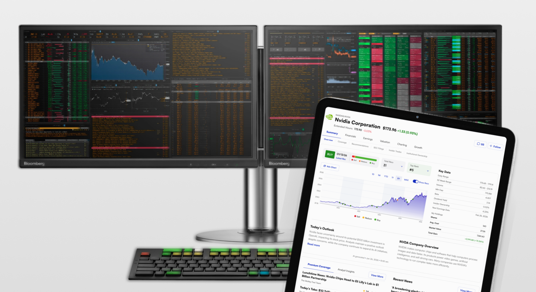
The actual audience — whether institutional clients preparing for their own customers or the much larger collective of retail investors — mostly can't parse those screens the way someone inside the industry would. The rare few who can are typically the loudest voices in the room, which reinforces the cycle. But they're not representative.
Building for yourself and assuming the user will put in the work to catch up isn't confidence — it's indulgence. And the cost doesn't show up in the data. It shows up in the silent click to the next screen.
The design challenge isn't removing information. It's sequencing it — surfacing key details in an order that builds understanding rather than demanding it.
Clarity is a design material
Simplification has its limits. In finance, you can't remove essential information. Regulatory requirements, compliance language, and investor disclosures aren't optional. The design challenge shifts from reduction to structure.
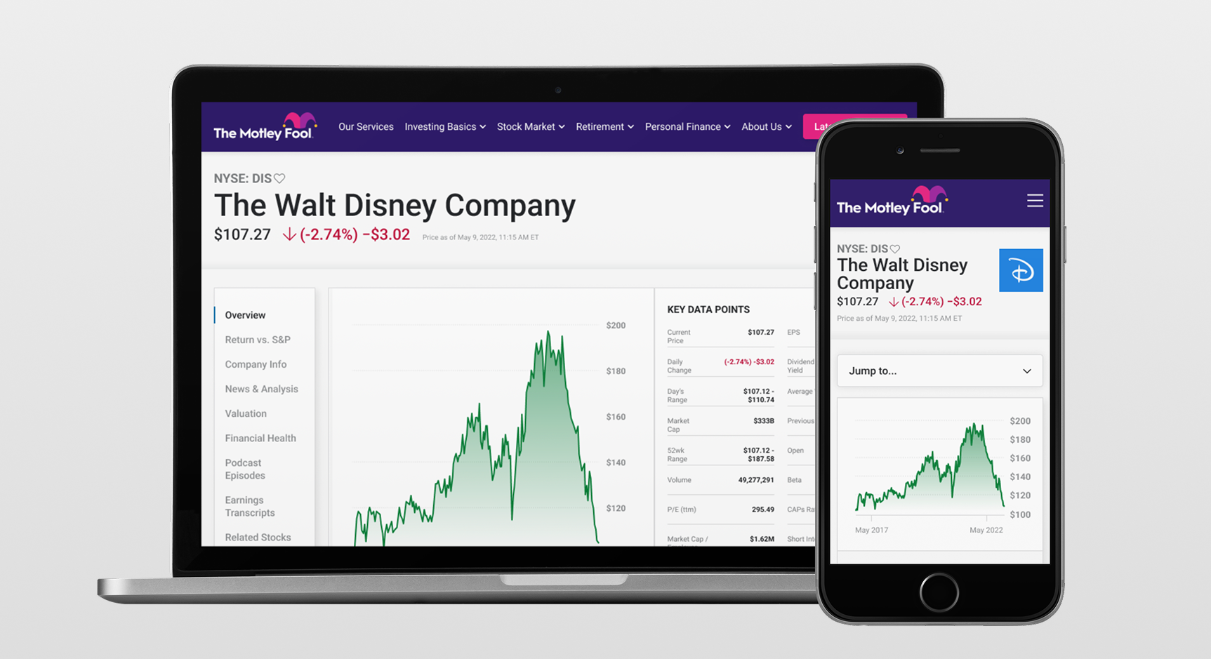
Hierarchy does most of the work. What does someone need to understand first? What supports that understanding? What's necessary but secondary? Every round of user research I've done on individual stock experiences gave the same clear sequence: the ticker name, the current price with today's movement, then longer-term performance. On a stock detail page, that's the logo and name, price and percentage change, then a chart. In a portfolio tracker row, it's the same information compressed — logo and ticker, price and movement, then a sparkline. Getting those three things right, in that order, is what makes an interface feel approachable. It's already building trust by putting the most sought-after information front and center.
Progressive disclosure helps too. Not everything needs to be visible at once. An investing thesis can be as short as an executive summary — absorbed in ten seconds. The supporting article takes two minutes. The full research report is there when the user is ready for it. That's not hiding information — it's respecting the reader's attention and their autonomy to choose how deep they need to go before making a decision.
That was part of the effort I led redesigning the premium product ecosystem at The Motley Fool. Their product collection spanned dozens of individual investing services. The design challenge wasn't improving any single star product — it was making the whole constellation usable together.
I led the work of abstracting shared elements into a central hub, turning individual products into spokes around a unified experience: your watchlist, your portfolio tracker, your community boards, all in one place instead of scattered across subscriptions. Each product still had its own investing thesis and editorial voice. But the structural layer had to hold it all together so that owning two, five, or forty services felt like using one product, not many competing ones.
Everything has to agree
Credibility in a financial product isn't carried by any single layer. The brand voice, the product interface, and the data presentation all have to tell the same story. When one contradicts the others — a playful tone sitting on top of a dense performance table, or a polished UI that links to a disorganized PDF — the user feels the seam. That seam is doubt.
This is what I focused on with fooletfs.com and the broader Motley Fool Asset Management ETF product marketing. The goal was never to make complex financial data look simple. It was to make it feel organized — so that an investor could move from curiosity to confidence without friction.
That means continuity across platforms and media. The billboard I designed for Times Square has to share brand elements, tone, and messaging with the email in your inbox, the booth at Future Proof, the quarterly fact sheets. Each touchpoint had its own constraints and use case. But the design principle was consistent: treat the investor like someone who is smart and paying attention, and meet them where they are. Every surface reflects that.

Trust is designed
Trust isn't a feature you ship. It's the cumulative result of every design decision — from information hierarchy to typography to how a disclaimer is positioned on the page — being aligned toward the same goal: clarity, accuracy, and respect for the person evaluating your product.
In finance, the cost of getting that wrong isn't just a bad user experience. It's the investor who was looking for exactly what you offer and couldn't tell. They didn't leave because of bad returns. They left because nothing in the experience gave them enough confidence to start. That's the bullet hole that never shows up in the data. And that's the responsibility that makes this kind of design work worth doing carefully
The views expressed here are my own. The mistakes are also my own, and probably more interesting. Work referenced reflects my contributions as part of larger teams — good outcomes were collaborative, questionable decisions I'll take full credit for.
Portions of this content were outlined and proofread with the assistance of AI tools.