A stakeholder once asked my team to “remove the clip art” from a design. There wasn’t any clip art — they meant the iconography. But the comment stuck with me, because it pointed to something worth unpacking: if the people approving design work can’t distinguish between iconography and clip art, that’s a communication gap worth closing.
And honestly, the confusion is understandable. On the surface, these two things look alike.
Where they overlap
Iconography and clip art are both collections of pre-made digital images. Both tend toward simple, line-based graphics that scale well. Both can be pulled from a library. If you squint, they’re cousins.
But the similarities are only skin deep. They diverge sharply in purpose, quality, and impact.
What iconography actually does
Iconography has become foundational to modern digital interfaces — the icons on your phone’s home screen, the navigation in your favorite app, the symbols in a checkout flow. Designers reach for it because it serves specific, measurable goals.
It provides visual clarity, conveying meaning quickly in space-constrained environments. It reinforces brand recognition by creating a consistent visual language across products. It improves usability, guiding users through complex interfaces. It increases accessibility, offering clear visual cues for users with impairments. And it supports cultural sensitivity, communicating across language barriers in ways text alone can’t.
Each of these is a design decision tied to user outcomes — not decoration.
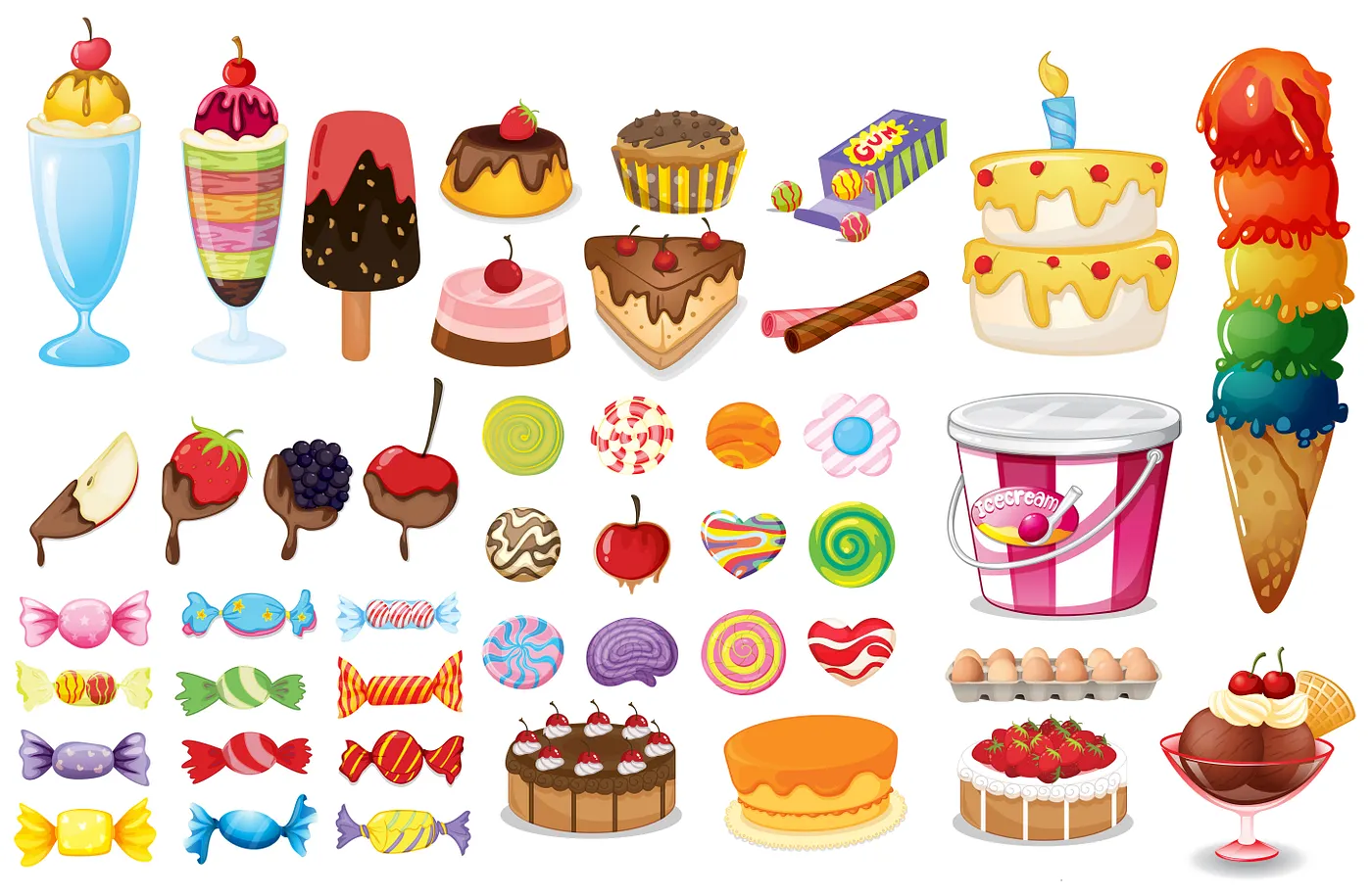
Why clip art fell out of favor
Clip art was sold on volume. You bought a CD-ROM with thousands of images, most of which had nothing to do with your project. The value proposition was convenience: a quick way to add visual interest to a document without creating anything original.
That convenience came with costs. Clip art aged poorly — the styles are locked in the 1990s and read as unpolished today. And because it was so accessible, it was used indiscriminately, dropped into presentations whether or not it matched the subject matter. Over time, clip art became synonymous with “low effort.”
Why the distinction matters
When iconography gets dismissed as clip art, the concern usually isn’t aesthetic — it’s rooted in a reasonable association with overused, low-quality graphics. That’s a fair instinct. The problem is that the instinct leads to removing something that’s actually doing real work: improving navigation, reinforcing brand, and making content more accessible.
The solution isn’t to argue about terminology. It’s to make the case for what the iconography is doing on the page — and that’s on designers to articulate clearly, not on stakeholders to intuit.
Disclosures: All thoughts and explanations — the accurate ones and especially the inaccurate ones — are my own and do not reflect the views of my employer, who, as noted above, remain unconvinced. Reach out if this resonated, and follow for more on design, coding, and the ongoing effort to defend the humble icon.